Rolex, Swatch, and More: The Best Watch Advertisements
Beautiful, Important, and Fun: 10 Watch Advertisements Worth Collecting - And Framing!
This isn't my "10 Best" list. Narrowing down the very-best 10 from hundreds of great ads would be a torturous task. This list is simply 10 really-good watch advertisements. Ads that cover the decades. Come in black and white - and color. Ads for simple and fun watches, but also featuring icons and Grails. Many incredible ads aren't part of this selection. You won't see the Matterhorn or Cartier Panther - ads that proudly hang in our home. I mostly went down the list of watch brands and allowed the ads to jump out at me. Some did for sentimental reasons. Some did for historical reasons. Some because they felt under-appreciated. Without further ado, here's some good ones - that'll look awesome framed. Enjoy!
1966 Rolex Datejust w/ "Explorer dial" Submariner and "Le Mans" Daytona

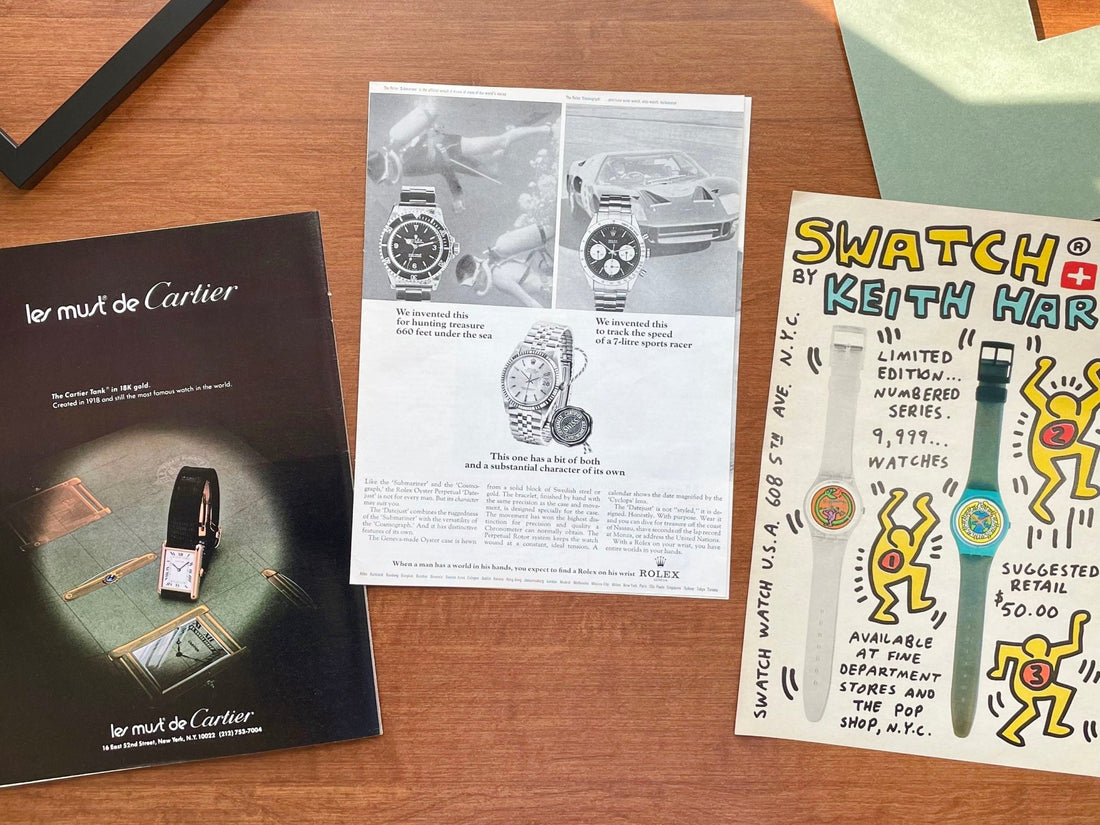
This is the first watch advertisement I vividly remember targeting and hunting. The thrill and excitement I felt when I finally figured out the magazine it was published in, I still feel today every time I chase and discover a great ad. This being said, I'll always have a fondness for this ad for sentimental reasons. But personal connection aside, it's truly an awesome ad. The layout, showing 3 watches, was used several times in 1966 with various combinations of Rolex models. Of course, this trio, headlined by the Ref. 5513, 3-6-9 "Explorer" dial Submariner seemingly made for the UK market and the very-first, underline dial Ref. 6239 Daytona - or rather "Le mans" - takes first prize. However, if you actually read the advertisement, and take into account the centerstage positioning of the Ref. 1601 Datejust, you'll come away realizing the focus isn't selling the dive watch or the chronograph... It's more-heavily marketing the Datejust, essentially saying it's just as good. The final paragraph about the Datejust are words to remember, especially considering how we view and treat certain Rolex models today: "Wear it and you can dive for treasure off the coast of Nassau, shave seconds off the lap record at Monza, or address the United Nations." So good. Finally, I'll say this particular ad was created in two versions... This particular variant features enlarged background imagery behind the Submariner and Datejust - scuba divers and a vintage Ford GT40 - making the ad even cooler.
*currently have a beautiful example available
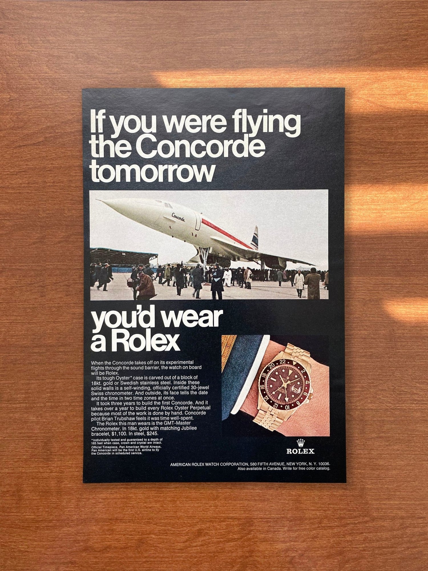
1967 Rolex Oyster Perpetual "if you were climbing..."

When it comes to the best Rolex advertisements, certainly the "If you were..." campaign comes to mind. It's probably the most well-known, most-recognizable print advertising Rolex ever did. But these ads, which are almost exclusively the way Rolex marketed watches from 1967 through early 1970, aren't famous because of the models featured, like Submariners and GMT Masters, or classic copy, like "If you were looking for lost empires..." or "If you were flying the Concorde..." I'd say they're famous and well-loved, first and foremost, because of the layout and design of the campaign. Creatives at J. Walter Thompson conceived the iconic template, which still makes an impression today. I like to say if you spot the black background ad with contrasting white Helvetica font from across a room, you know you're looking at a Rolex ad. That's precisely why I didn't choose to showcase a more-popular ad like "If you were skiing here tomorrow" paired with an Explorer. Instead I opted to share one featuring a quieter, yet no less competent, Rolex, the reference 1005. Simply put, I feel the pièce de résistance, is the artistry of the advertisement. Any "If you were..." ad is beautiful and worthy of prominent placement in a home or office, no matter the watch in the thumbnail image.
*currently have a super-clean example available
1950 Patek Philippe "Hourglass"

Framing a magazine advertisement may not be the norm. Certainly we're more-accustomed to framing photographs, paintings, and the like. But I believe advertising is an art form, and more and more, ads are coming to light that not only prove this, but when framed with thought and care, can go toe to toe with the most eye-catching pictures and beautiful works gracing canvases. Case in point is this early 1950s Patek Philippe advertisement, which origin can be traced to a niche Italian publication. The colors and artistry are so strong, you don't need to have an "Hour Glass" reference in your collection to fall in love with and appreciate the ad. This objet d'art, with its apparent brushstrokes and rich illustration, is a Patek relic - a masterpiece in advertising form like how a Patek Philippe is a masterpiece in the form of a timepiece. This ad is an ode to Patek. It symbolizes the beauty of Patek's watches and speaks to their longstanding history and place in watchmaking. And if there's still any doubt about its museum gallery quality and importance in the legendary advertising oeuvre of the brand, look no further than the cover image of noted Patek Philippe expert John Reardon's book, Patek Philippe in America: Marketing the World's Foremost Watch.
*currently have an excellent example available
1970 Omega Speedmaster "NASA select second best?"

Omega Speedmaster advertisements have to be among the most-effective of all-time. And imagine how influential Omega's campaign was in the late 1960s and early 1970s, when I'd say the space program was in its heyday. This ad, from 1970, is like the sun... it's at the center of a solar system of monumental Speedmaster ads. And like the sun, it's a bright spot. Brilliant in color and copy. The writing is genius, with the best lines embedded in the finer print paragraphs. Sentences like, "astronauts have worn Omegas watches on their wrists. Ordinary, everyday jewelry store Omega Speedmaster Chronographs. The kind anyone can buy." That simple message, that you could actually own the same equipment as an astronaut, was likely as powerful a pull to a jeweler as gravity is. It's obvious the wordsmith copywriters and master art directors were successful in their mission to create an effective ad for Omega. I think there can be a serious debate if this ad is the best Speedmaster ad ever... It certainly doesn't hurt that there's an incredible, oversized image of what could be a reference 105.012, 145.012 or 145.022-68, showing awesome detail, including lume that's the perfect tone of yellowish green, which Speedmaster collectors love to see.
*currently have a near-perfect example available
1974 Audemars Piguet Royal Oak Ref. 5402 "steel at the price of gold."

When Audemars Piguet is the topic of conversation the Royal Oak is usually the subject - likely the only model talked about. Similarly, when you look at this 1974 advertisement, that's probably all you see. It's hard to miss that super-sized Ref. 5402 sprawling across the page. It's hands-down the best image of a vintage Royal Oak ever printed in a magazine ad. The color and detail is just incredible - like you're looking at the actual seminal Genta work in your hand, in NOS condition, under the perfect natural light. You can almost feel the waffly texture of the tapisserie dial. Sense the links of the integral bracelet flickering as you roll your wrist. The curves, edges, finishing - and bolts - entrance you with their beauty. But if I stop here, you'd be missing the true beauty of this advertisement... Although the "Jumbo" Royal Oak appears to be the hero of the ad, with accompanying headline, "Introducing steel at the price of gold", there are co-stars in this ad... Remember, this ad is from an era when Audemars was heavily-marketing their groundbreaking luxury steel sports watch concept, hoping it would be embraced. In the mid-1970s it's safe to say the Royal Oak wasn't the flagship it is today. More likely total revenue derived from scattered sales across a diverse collection, represented by the timepieces shown beneath the Royal Oak. Despite their lower position in the ad, they're certainly not beneath the Royal Oak in terms of daring design and exquisite execution. Those "other rewarding contradictions" include a breathtaking "Skeleton" pocket watch, intricately faceted diamond hands, and the world's thinnest ladies movement. Today, we ohh and ahh over the extraordinary and unique Royal Oak creations (and we should gush). But we forget the same genius, boldness and craftsmanship is present in other Audemars Piguet watches, including these vintage beauties, the Starwheel, Code 11.59, and more... This ad reminds us about the history and spirit of Audemars Piguet, which is the reason I think this is the best Audemars Piguet ad of all-time. Emphasis on "Audemars Piguet" because it's more than a Royal Oak ad.
1996 A. Lange & Sohne Lange 1 at Cellini

This advertisement makes this shortlist partly because it's on my shortlist of watches to own someday... The Lange 1, or more preferably, the Little Lange 1 is a watch I "need" to have. But for now, collecting and being close to the original advertisements do the trick. One aspect of A. Lange & Sohne I love is the history of the brand. More specifically their rebirth in the mid-1990s and the vital role print magazines and retailers played in launching and spreading the word about the company. Which brings me to this particular ad... Besides featuring a dreamy image of a yellow gold Lange 1 on a dark brown alligator strap, it features the name "Cellini" - one of the first authorized dealers selling Lange watches. Along with WEMPE these two retailers are crucial to the story of Lange and how the brand has become so appreciated, respected and collected, similar to how Patek Philippe is viewed and treated. The history embedded in the ad is a big attraction for me. But of course, how the ad looks matters immensely too... And the choice of using a warm, reddish orange background perfectly compliments the warm tone of the case, making the iconic asymmetric, champagne dial with signature outsize "Big" date shine. Being from 1996, means it's one of the earliest print advertisements ever published. Looking closely, the example pictured is likely a reference 101.002. It's clear the dial is an early variant with sans-serif "Made in Germany" text. The only way to make this ad better, would be to show the movement - a thing of beauty in and of itself. Of course, this being an early ad, the reference shown may be a 101.001 with a solid caseback...
*currently have a perfect example available
1979 "les must de Cartier" Tank Louis

"Les Must de Cartier" basically translates to "you must have a Cartier!" Today that seems so obvious given the newfound appreciation collectors and newbie watch enthusiasts have for Cartier pieces. You don't want to be left out of the fun and games! But in the mid-1970s when this phrase was penned, the market for Cartier wasn't what it is today. There certainly was no "Hype." So to help bolster sales and welcome a new clientele, Cartier created a line of more approachable watches based on their keystone Tank Louis Cartier design. Key attributes of the new line included a gold-plated case and eventually offering a quartz movement. Interestingly, the Tank under the spotlight isn't a "Must" model, but rather a traditional solid gold Tank. It seems Cartier "must" have loved the "Les Must..." tagline so much it just became part of their branding. Speaking of Cartier as a brand, I find myself saying to people Cartier is all about design. After all, their well-known motto is, “never imitate, always innovate.” Since aesthetics and design have always been paramount when it comes to creating jewelry and timepieces, it's only natural their advertising follows suit. Although appearing on the pages of magazines, the layout and art direction of many vintage Cartier advertisements create an illusion making the jewelry and watches appear how you would experience them in a boutique. Just look at this ad, which I chose to highlight because of how the watch is highlighted... You can easily imagine seeing this Tank under the warm lights of a display case. And to me, the underlying sketch represents the salesperson who would invariably tell you about the history of the Tank, including its shape. Because vintage Cartier ads capture the ambiance of stepping foot inside a boutique, I find they're ideal for framing. Who doesn't like decorating their home with something luxurious.
*currently have a gorgeous example available
1932 Jaeger LeCoultre Reverso

A question I get from time to time is, "what's the oldest ad you've found?" Honestly, that's not what I'm trying to do. First and foremost, I'm trying to find the best ads... Ads I think are beautiful, important, and in very-good condition. If an advertisement I come across meets those criteria - and happens to be very old - the age is a bonus. Which is exactly what happened with this Jaeger LeCoultre Reverso ad. It's from 1932 and is probably the oldest ad I've found and offer for sale. And if you own, collect or know anything about the Reverso, that year should stand out... It's only one year after the model was introduced. I'll do the math for you - this page is almost 92 years-old! It's entirely possible this is the very-first Reverso ad... Year aside, the ad is incredible. It's from a publication that yields the largest page, which is nice. And on that vast expanse is everything a Reverso lover could ever hope for in an ad... A larger than life image of the case in mid flip and showing high-def-like details of all its hallmark Art Deco design elements. Pay attention to those grooves and perlage! In addition, the ad includes a storyboard depicting the revolutionary design - how the watch transforms and can protect itself from the whack or strike of a polo mallet or ball. And of course, when the watch is fully flipped the inside caseback can bear one's initials, as the thumbnail image clearly shows this available option. It's one of those ads that's a no-brainer for a Reverso head, but also should be considered by anyone who appreciates horology. Back to the year... Because of the age, and printing/publishing processes used back then, this advertisement is truly artifact-like and can be enjoyed simply for the unique character that comes with something very-old. I personally could stand in front of framed example and gaze at all the nuances, just like I could gaze lovingly at a vintage watch dial. Finding magazine ads - saving them, framing them - feels great. But saving an advertisement like this, and framing it, feels like I'm a curator of a museum.
*currently have a really-good example available
1986 Swatch Keith Haring Limited Editions

Of all the ads I've come across - and framed - this is probably the one I enjoy the most hanging in our home. That's because we have kids. Although it's totally a watch ad, those watches are sorta hidden. They're camouflaged among the colorful characters, in letter form and cartoon form, widely known as the language and artistic style of Keith Haring. Keith's life and art are bold, fun, thought-provoking, impactful, you name it... Certainly one goal of his art was to bring people together. And that's exactly what this ad does for our family. It represents my passion for watches and our children's interest in drawing. And although they don't realize it, they're in the midst of a powerful art form that may influence them in a number of ways as they get older... But for now, it's a bright pop of color that looks right at home in our gallery of finger paintings, coloring, and doodles. I think Keith would love seeing his art on display alongside the prolific work of our kids. Of course, this original ad from 1986, doesn't just feature Haring's famous dancing, radiating figures. At the heart of this ad is his original "Limited Edition" collaboration with Swatch. A collab perfectly timed with the opening of his Pop Shop in SoHo. This ad definitely takes you back to a wild and fascinating time in the art world... A scene where you could easily rub shoulders with the likes of Basquiat, Warhol, Madonna, Blondie, and other famous artists, musicians, and celebrities of the 1980s. What a stage to witness... And what incredible, vibrant art you could acquire before it exploded in value. At least there's this original Haring advertisement I can afford. Which for me, is just as good as any signed lithograph.
*currently have a fantastic example available
*Also, a beauty all framed and ready to go!
1956 Universal Geneve Polarouter "SAS DC-7C"

Whenever I see a Polerouter with a tropical dial, I want one. It's hard not to love the caramel, chocolate - pick your favorite flavor of brown - dial. Seeing the beautifully aged dial in the sun, nestled inside a smaller case with mini "twisted" lugs, that's equal parts "dressy" and "sporty" is tough to resist. And if it has a trapezoid bubble magnifying a date - I might be making an impulsive purchase (that I won't regret). How I feel about the watch is exactly how I feel about this 1956 advertisement, which likely shows a Ref. 20214 or 20217. It was published only a few years after the Genta designed Polarouter was introduced, around 1954. And like the actual watch, and so many other midcentury designs of the era - from furniture to homes, I can't get enough of this particular ad. It's packed with so much goodness... There's a myriad of gorgeous and cool typefaces and fonts - that form words. And those words form copy. Copy that reads like the intro to a Wikipedia entry, providing context and history about the origin of the model. Of course, the Polarouter, with its anti-magnetic properties, was designed for Scandinavian Airlines System (SAS) pilots who flew over the North Pole, hence the name. If you didn't read the ad, you'd still get a sense of the watch's history and capabilities, simply by looking at all the imagery. The artwork, including illustrations of a pilot, the globe, airplane, and watch, visually depicts the story of the Polarouter, including the storied relationship between Universal Geneve and SAS. Since I first laid eyes on this ad many years ago, it continues to bring me joy. I never get tired of looking at it, especially framed in a fun way. This ad is like a gift that keeps on giving... You can simply appreciate it as a memento of a brand you love and collect. Or let it lead you down a rabbit hole to learn about the history of aviation and the "golden age" of commercial travel.
Thanks for reading! Stay tuned for another article!